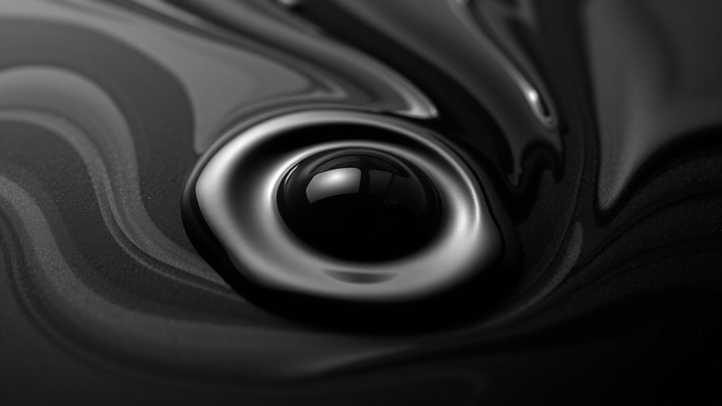

Understanding ink properties like sheen, shading, and saturation helps you create vibrant and professional artwork or prints. Sheen affects how shiny or matte your ink appears, while shading adds depth and realism with smooth tonal progressions. Saturation determines how intense or subdued the colors look. Adjusting these factors involves choosing the right formulation, pigments, and layering techniques. If you want to master these effects for your projects, exploring further will give you even more precise control over your results.

Get your wardrobe favorites delivered free with Prime
- Fast, free delivery on millions of items
- Prime Video, Amazon Music and more included
- Member-only deals all year
Key Takeaways
- Sheen determines the reflective finish of ink, ranging from glossy to matte, influenced by formulation and binders.
- Shading involves smooth tone and color variations, achieved through proper pigment dispersion and ink viscosity.
- Saturation reflects the color intensity; high saturation produces vivid colors, while low saturation yields muted tones.
- Ink formulation, pigment quality, and drying process significantly impact sheen, shading, and saturation outcomes.
- Consistent application and blending techniques enhance the visual depth and vibrancy of ink in artworks or prints.

Sheen relates to the surface reflection of the ink once it dries. Some inks have a glossy sheen, giving a shiny, reflective finish that makes colors pop and adds a sense of vibrancy. Others have a matte or flat sheen, resulting in a subdued, non-reflective appearance that can be preferred for certain printing styles or artistic effects. Achieving the desired sheen depends heavily on the ink formulation, particularly the types of pigments and binders used, as well as the ink’s drying process. When you choose an ink with the right sheen, you can enhance the visual impact of your work, making it more appealing and professional. ink formulation plays a crucial role in determining the sheen and overall appearance of the dried ink.
Shading refers to the subtle variations in tone and color depth within a single stroke or area. It’s what gives drawings and printed images a sense of dimension and realism. Proper shading depends on the ink’s ability to produce smooth gradations, which again ties back to its formulation. For example, inks with fine pigment dispersion and balanced viscosity allow for better shading effects, as they can be layered or blended without losing clarity. Ink consistency plays a foundational role here, ensuring that each application maintains the same density and flow, preventing unwanted blotches or uneven shading.
Saturation describes how intense or vivid the color appears. High saturation means bright, eye-catching colors, while low saturation results in more muted tones. Achieving high saturation requires a well-designed ink formulation that contains highly pigmented dyes or pigments. Consistent ink application guarantees that the saturation remains uniform across your work, avoiding areas that look dull or overpowered. Whether you’re printing a photograph or creating detailed artwork, understanding these properties helps you select the right ink and achieve the visual effects you desire. In the end, the quality of your finished piece hinges on how well the ink properties are managed through precise formulation and consistent application.
professional ink with high sheen
As an affiliate, we earn on qualifying purchases.
As an affiliate, we earn on qualifying purchases.
Frequently Asked Questions
How Does Paper Type Affect Ink Sheen and Shading?
You’ll notice that paper type greatly influences ink sheen and shading because of its fiber texture and ink absorption. Smooth, glossy paper allows ink to sit on the surface, enhancing sheen and vibrant shading. In contrast, rough or matte paper absorbs ink quickly, dulling sheen and reducing shading contrast. Your choice of paper determines how ink interacts, affecting the overall appearance of your artwork or print.
Can Ink Properties Change Over Time or With Exposure?
Did you know ink can change over time? Yes, its properties like sheen, shading, and saturation can alter due to exposure. When exposed to light, air, or moisture, ink may fade or experience color change, affecting its appearance and value. So, if you’re preserving artwork or documents, consider how environmental factors might impact your ink’s original qualities, making it look different than when you first applied it.
Which Inks Are Best for Archival or Long-Lasting Purposes?
For archival or long-lasting purposes, you should choose inks with high durability and archival quality. These inks are specially formulated to resist fading, water, and chemical exposure over time. Look for pigment-based inks rather than dye-based ones, as they tend to last longer and retain their color. Brands like Archival Ink or India ink are excellent choices, ensuring your work remains vibrant and intact for decades.
How Do Environmental Factors Influence Ink Saturation?
Think of your favorite ink as a sponge soaking up sunlight. Environmental factors like humidity, temperature, and sunlight exposure directly impact ink absorption, causing colors to fade over time. For instance, in a sunny window, ink saturation diminishes faster, akin to a vibrant painting fading in the sun. To preserve your ink’s richness, keep it in cool, dark places, minimizing environmental stress that accelerates color fading.
Are There Inks Specifically Designed for Vibrant or Subtle Effects?
Yes, you can choose specialty inks designed for vibrant or subtle effects. These inks are formulated to enhance color vibrancy or create softer, more muted tones. When you want eye-catching, bold results, opt for inks with high pigment concentration. For delicate, understated designs, select specialty inks that emphasize subtlety. By carefully selecting these inks, you can achieve the precise visual impact you desire, whether it’s vividness or subtlety in your project.
As an affiliate, we earn on qualifying purchases.
Conclusion
Understanding ink properties like sheen, shading, and saturation helps you achieve the perfect look for your project. Did you know that high-quality inks with rich saturation can make colors appear up to 30% more vibrant? By mastering these properties, you’ll guarantee your artwork or print stands out with clarity and depth. So, pay attention to these details—they make all the difference in creating visually stunning results that truly captivate your audience.
As an affiliate, we earn on qualifying purchases.
As an affiliate, we earn on qualifying purchases.
Halloween Picks
halloween
As an affiliate, we earn on qualifying purchases.