You can create a sense of elegance and calm in your luxury interiors by choosing colors that evoke specific psychological effects. Cool shades like blues and greens promote tranquility and trust, making spaces feel serene. Warm tones such as reds and oranges energize and add warmth when used thoughtfully. Pairing contrasting or monochromatic hues enhances sophistication and emotional resonance. By understanding these color influences, you’ll craft environments that feel both opulent and peaceful—discover more ways to elevate your space as you explore further.
Key Takeaways
- Cool hues like blues and greens promote tranquility and sophistication, ideal for creating calm luxury environments.
- Warm tones such as reds and oranges evoke energy and passion, adding warmth and vibrancy to upscale interiors.
- Strategic color pairings, like deep neutrals with metallic accents, enhance elegance and emotional resonance.
- Monochromatic schemes foster cohesion and a refined aesthetic, reinforcing a sense of calm and luxury.
- Incorporating modern technology and innovative color management elevates design precision and emotional impact.
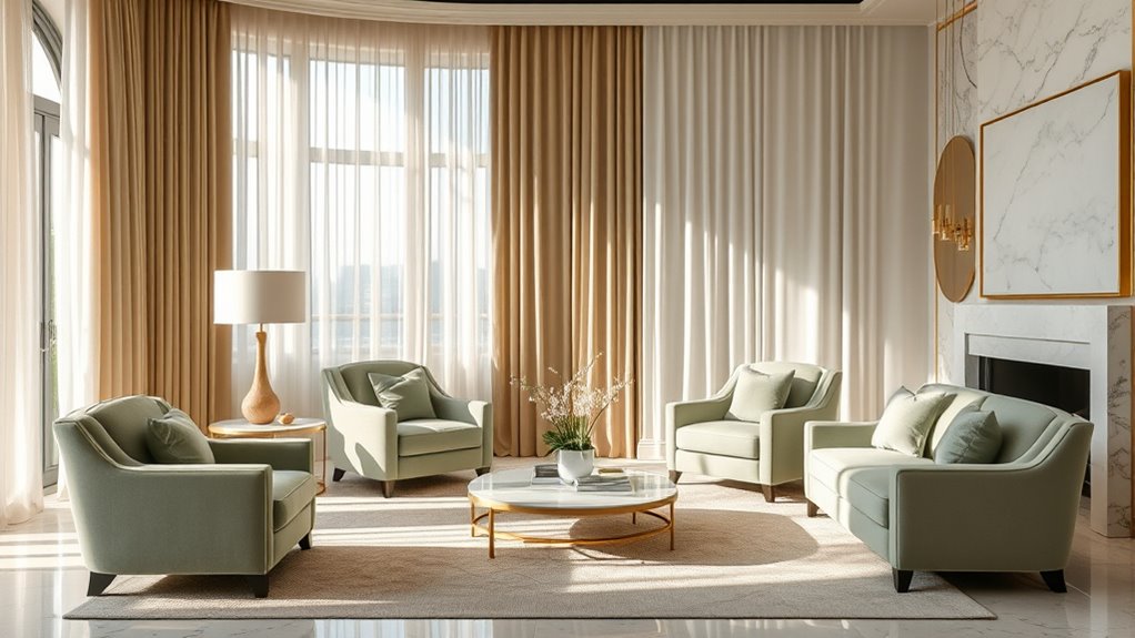
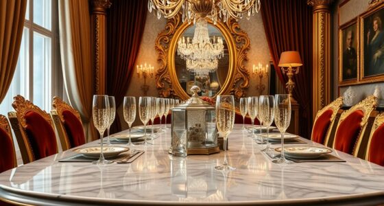
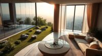
Have you ever wondered how the colors in a luxury interior can influence your mood and perception? The truth is, color choices do more than just decorate a space—they evoke psychological effects that shape how you feel and behave. When designing a high-end interior, understanding the impact of colors and their strategic pairing is essential. For example, pairing deep blues with soft neutrals can create a calming atmosphere that promotes relaxation, while combining rich gold accents with warm beige tones adds a sense of opulence and warmth. The way you combine colors influences not only the aesthetic but also the emotional resonance of a room.
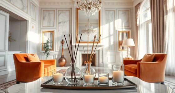
Psychological effects of colors are powerful tools in setting the tone of a luxury space. Cool hues like blues and greens are often associated with tranquility, trust, and sophistication. These shades can make a room feel more spacious and serene, perfect for bedrooms or living areas meant for unwinding. Warm tones such as reds, oranges, and yellows evoke energy, passion, and warmth, which can energize a space when used thoughtfully. When you choose colors based on their psychological effects, you craft an environment that aligns with the mood you want to cultivate, whether it’s calm, invigorating, or luxurious.
Colors shape mood—cool tones evoke tranquility, warm shades energize, crafting luxurious, emotionally resonant spaces.
Color pairing plays a pivotal role in elevating the elegance of a luxury interior. Combining contrasting hues—like deep charcoal with crisp white—creates a striking balance that feels both modern and refined. Alternatively, monochromatic schemes using different shades of a single color can bring a cohesive, sophisticated look that emphasizes subtlety and depth. The key is to be deliberate with your pairings; contrasting colors can energize a space, while harmonious combinations foster a sense of calm and unity. When you master color pairing, you not only enhance visual appeal but also influence how people experience the space emotionally.
In luxury interiors, every detail counts, and color is no exception. By understanding the psychological effects of different hues and how to skillfully pair them, you can design environments that communicate elegance and serenity. Remember, the right combination can make a room feel inviting, opulent, or peaceful—sometimes all at once. Your choices in color and pairing aren’t just about aesthetics; they’re about creating an atmosphere that resonates with those who enter. With thoughtful selection, your interior will not only look stunning but also evoke the feelings you want your space to inspire. Additionally, considering innovative European cloud solutions can inspire a modern approach to incorporating technology seamlessly into your luxurious designs, blending aesthetics with sustainable innovation.
Top picks for "color psychology luxury"
Open Amazon search results for this keyword.
As an affiliate, we earn on qualifying purchases.
Frequently Asked Questions
How Do Lighting Choices Affect Color Perception in Luxury Interiors?
Lighting design and color temperature considerably influence how you perceive colors in luxury interiors. Warm lighting with a lower color temperature enhances cozy, rich hues, making spaces feel inviting and elegant. Conversely, cool lighting with a higher color temperature highlights crisp, clean tones, creating a calm and modern atmosphere. Your choices in lighting design directly impact the overall mood, emphasizing certain hues and elevating the sense of luxury and tranquility.
Can Color Psychology Influence Mood and Behavior in Opulent Spaces?
Yes, color psychology can influence your mood and behavior in opulent spaces. When you select colors based on color symbolism, you evoke specific emotional impacts—like calming blues or energizing reds—that enhance your experience. Using luxurious hues thoughtfully creates an ambiance that promotes relaxation, confidence, or inspiration. This emotional connection helps you feel more comfortable and engaged, making your space not just elegant but also emotionally nurturing.
Which Hues Are Best for Enhancing Spaciousness in Luxury Rooms?
You notice how monochrome schemes and pastel shades effortlessly enhance spaciousness in luxury rooms. Light, neutral colors reflect more light, creating an airy, open feel. Monochrome palettes with subtle variations add depth without cluttering the senses, while soft pastels bring calm and expand the space visually. By choosing these hues, you make your room feel larger, more elegant, and inviting—turning a cozy space into an expansive retreat.
How Do Cultural Differences Impact Color Choices in Luxury Interior Design?
Cultural differences substantially influence your color choices in luxury interiors, as you need to take into account cultural symbolism and color traditions. You might select red for passion and luck in some cultures, while in others, it signifies danger. By understanding these nuances, you guarantee your design resonates respectfully and meaningfully. Tailoring hues to cultural symbolism creates an elegant, calm environment that feels personalized and culturally aware.
What Are the Latest Trends in Luxury Color Palettes for Calm Environments?
You should consider adopting monochromatic schemes combined with metallic accents for a calming luxury palette. These trends emphasize subtle variations in color, creating a serene atmosphere, while metallic touches add sophistication and a modern edge. Focus on soft neutrals like beige or muted greys, and enhance them with gold or silver details. This combination delivers elegance and tranquility, aligning perfectly with the latest preferences in luxury interior design for calm environments.
Conclusion
By blending bold blues, plush purples, and calming creams, you craft a captivating, calming space that exudes elegance. Let your choices create a tranquil, timeless tapestry of taste and tranquility. Remember, the right hues heighten harmony, highlighting your luxurious lifestyle. With a thoughtful touch of color, you turn your interior into a beautiful, balanced haven—bringing serenity and sophistication seamlessly together. Your space becomes a stunning showcase of style, serenity, and sophistication.